The logo colors of photography
Harness the psychology of color to build your brand.

by BATHI
What color will give you the right exposure?
Photographers, it’s time to zoom in on branding. As a creative professional, your unique artistry needs to be captured in all things visual. Potential clients will be judging you from every angle, so it’s important to present an identity that’s as visually compelling as your images.
How do you choose a color for your photography logo that reflects your unique style and also helps you stand out from the crowd? We’ve analyzed the color palettes of over 200 photo industry logos, evaluated the brand personality traits that photographers want, and consulted color psychology experts in order to help you decide.
Framed in black and white: a snapshot of the popularity of photography colors
-
 All data visualizations designed by MH Designs.


When we focus on the fact that photography companies are looking to impress clients with a high level of sophistication, and take the medium into account, it’s no surprise that black and white are the most popular logo design colors. Black is requested in 46% of photography logos on 99designs, and appears in a whopping 59% of industry-leading photography logos. Black’s classic partner in sophistication, white, comes in a close second at 41% both on 99designs and throughout the industry.
Beyond these classics, photographers on 99designs rely on the limited stock of gray and blue. Industry leaders only expose one more color with any sort of regularity: red. For a visual industry, photographers seem to shy away from full color logos. In particular, purple, brown and pink are almost always left out of the picture.
Industry-leading photography companies often rely on red to punch up the drama:
Industry-leading photography companies often rely on red to punch up the drama:
The logos from the four of the top photography brands pair simple typography with a bold showing of red to focus the eye.
The colors you select for your logo have a huge effect on how consumers view your brand. But before you start wondering how your small photography business can emulate the success of industry leaders, consider one huge difference: you. These companies are simply too huge to cater to a distinctive style, whereas your personality and style is what defines your brand. Are you a wedding photographer or do you specialize in commercial gigs? Are your images bold and beautiful or abstract and ethereal? How would your clients describe the process of working with you?
Once you know what you want your brand personality to be, it’s easy to translate those traits into colors.
Get ready for your closeup: brand personality colors in photography
Start determining your brand personality by asking yourself these six questions:
- Gender: Is my brand traditionally masculine or feminine?
- Tone: Is my brand playful or serious?
- Value: Is my brand luxurious or affordable?
- Time: Is my brand modern or classic?
- Age: Is my brand youthful or mature?
- Energy: Is my brand loud or subdued?
We'll use your answers to see what logo color works best for you.
Here's how photography businesses on 99designs define their brand personalities:
-
We analyzed the preferences of all industries and assumed normal distribution. Preference strength was figured on number of standard deviations from the mean.

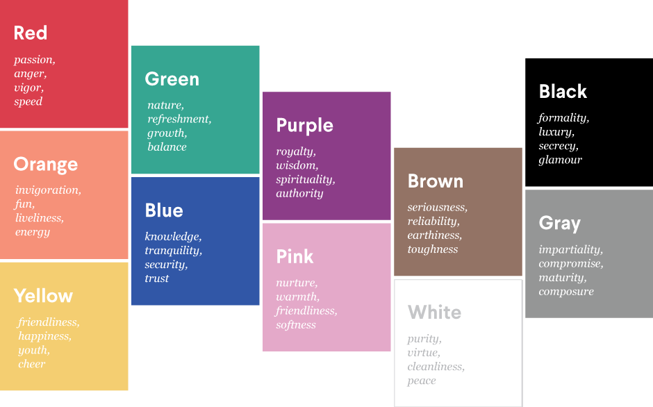
From this we infer that people in the photography business want to look luxurious, modern and subdued. These align with the following colors:

Based on this, we would expect to see a lot of purple, pink and black photography logos, and very few that are orange and yellow.
In reality, we see a whole lot of black and white, with very little purple and pink. Black has high associations with being perceived as luxurious. It’s also versatile enough that, with the proper exposure, it can also be both modern and subdued. It seems to be a model color choice.
But what about purple and pink? How can they rank so high on the luxurious and subdued scales, yet appear in so few photography logos? What’s not taken into account here are the other associations with these colors. Pink is seen as feminine and nurturing; purple, spiritual and royal. Many photographers want to steer clear of colors that create such specific perceptions about their style. And they’re not alone: when we analyzed 527 leading logos across industries, pink and purple were among the least popular.
With a logo that’s primarily black and white, on the other hand, photographers can rely on their images to communicate a particular artistic style. The strong contrast of this classic combo provides the perfect foundation for adding personality through a dash of color. Bright accents grab attention and indicate aesthetic strength.
A winning lens: what colors should photographers focus on?
Most photographers prefer the tried-and-true duo of black and white when it comes to selecting logo colors.
But what if you want to shoot from a different angle and stand out from the crowd? If you’re willing to stray from the black-and-white standards of photography logo colors, there are several ways you can visually stand out, but still maintain a brand personality that’s high in luxury.
Both pink and purple are perceived as serious, subdued and mature, yet each appear in less than 2% of all industry-leading photography logos. If you want to play up your intelligence, consider the wisdom of purple. If you’d like to attract a new customer base for your business shooting newborns or weddings, nurture them with a pink logo.
You could also follow in the footsteps of photographers on 99designs who have chosen to play up other brand personality traits in their logo color choices.
-
Wedding photographer Marta Eve—who targets mid-thirties lovebirds in London—pairs a spot of bright yellow with a friendly font and playful heart to bring her warm personality into this primarily black logo.
-
Fotostat, a startup that allows photographers to manage multiple online presences in one place, asked designers for a logo that’s modern and simple. Combined with black, the turquoise color plays up their innovation factor.
-
The field of professional photography has been growing exponentially. To stand out to high-end clients, wedding and portrait photographer Nicholas Critelli chose a deep crimson red that catches the eye with bold sophistication.
Developing your brand is as important to your business as your arsenal of camera lenses (and thankfully, it’s a lot cheaper). As you set out to design your photography logo, you’ll want to take your brand personality into account, and think about the traits you most want to convey. Color is a personal choice, but understanding color psychology in marketing can help you make an informed decision for your small business.
Have we confirmed your choice for black and white? Or made you pine for purple? Either way, when you design your logo you’ll know it’ll be one that captures your personal style.
Blue collar, white collar, purple collar: what are the colors of other industries?
Get a photography logo design now!
Want to know more about how design impacts business?
Subscribe and be inspired by our best tips, trends and resources.
We'll also send you the occasional marketing email and promotion (which you can opt-out of anytime).