The logo colors of technology
Harness the psychology of color to build your brand.

by Pinch Studio
Developing a brand that clicks with consumers
Technology companies all want to be the next big thing. Their products often seek to meet needs that consumers don’t yet know they have, carving out a niche for themselves in a saturated market. An innovative idea is only the starting place; to stand out from the competition, tech companies also have to show they're competent and capable of running a sustainable business.
How do you choose a color for your logo that screams modern and innovative, brings brand personality to the fore, but also conveys your sophistication and business acumen? We’ve analyzed the color palettes of over 1,000 tech company logos, evaluated the brand personality traits that technology entrepreneurs want, and consulted color psychology experts in order to help you decide.
Pixel by pixel: running the data on technology colors
-
 All data visualizations designed by MH Designs.
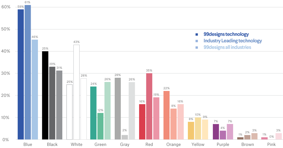
There’s only one constant in Silicon Valley and other tech centers, and that’s change. That being said, there are four general, bold colors that industry leading technology companies seems to rely on: blue, white, black and red; no other color appears in more than 12% of logos.
Logo color requests in 99designs contests are decidedly more diverse, with the above colors being augmented by gray, green, orange, and red. Technology is the only industry in which contest-holders have a more colorful palette than industry leaders. Does that mean they’re thinking too outside of the box?
In a fast-changing industry with many new players, reliability is key. So it’s no wonder that blue—requested in 59% of technology logo design contests on 99designs and appearing in 61% of logos from the top technology companies— is chosen as a staple color. What is compatible with cool blue? Clean white. It appears in over 40% of industry-leading logos. Red is also a fiery hit with industry leaders, making an appearance over one third of the time.
Less popular choices include brown and pink, both appearing in less than 2% of all technology logos. The earthy and childish associations of these two respective colors likely do not align with the sleek, modern aesthetic of most tech companies.
When we look at the logos from the world’s top four tech companies, however, we see a wide number of hex codes represented, with a less obvious inclination towards blue:

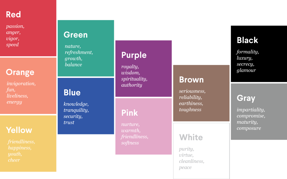
Google and Microsoft use a bright combination of blue, red, green and yellow. This mix represents their wide variety of product offerings while communicating action (red), freshness (green), fun (yellow) and security (blue).
While Apple most definitely had a technicolor period (1976 to 1998), the highly-lauded brand sticks with a luxuriously simple, monochromatic treatment. And like Apple, Samsung sticks to just one color: a strong, dependable navy blue.
The colors you select for your logo design have a huge effect on how consumers view your brand. How might a startup emulate the success of trendsetting industry leaders before they get their A-round of funding?
Once you know what you want your brand personality to be, these traits and values often determine which colors are used in your branding.
Check your profile: colors of brand personality in technology
Start determining your brand personality by asking yourself these six questions:
- Gender: Is my brand traditionally masculine or feminine?
- Tone: Is my brand playful or serious?
- Value: Is my brand luxurious or affordable?
- Time: Is my brand modern or classic?
- Age: Is my brand youthful or mature?
- Energy: Is my brand loud or subdued?
Here's how technology businesses on 99designs define their brand personalities:
-
We analyzed the preferences of all industries and assumed normal distribution. Preference strength was figured on number of standard deviations from the mean.
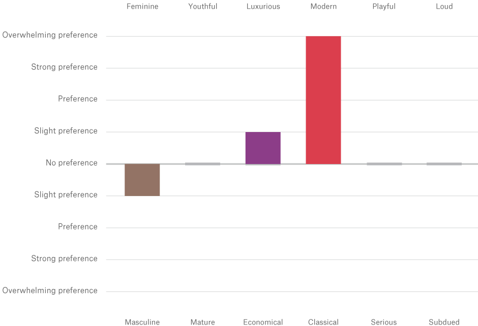
From this we infer that people in technology want to appear modern, masculine and luxurious. These align with the following colors:
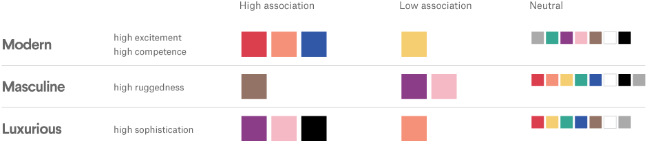
Based on these traits, we’d expect to see many red, blue and brown technology logos, and very few that are yellow.
In reality, we do see a lot of blue and red, but very little brown.
The combination of black, white, red, and blue make up the majority of colors used in technology logos. Blue evokes reliability and competence, while red connotes excitement and brings attention to the innovative nature of the products.
So why aren’t we seeing more brown logos? Maybe people associate brown with earthiness (even dirt), which is quite the opposite of the almost stereotypically clean and minimal tech aesthetic.
So why aren’t we seeing more brown logos? Maybe people associate brown with earthiness (even dirt), which is quite the opposite of the almost stereotypically clean and minimal tech aesthetic.
-
Sheva creates abstract yet clean logos that are destined to be emblazoned across the next big tech product. Design by sheva for Scalepoint.
-
Bo_rad’s portfolio is bursting with blue logos – perfect for projects in the tech industry. Design by bo_rad for Path
-
Corne’s logo for Buzzi puts a twist on your average tech logo elements, helping it to stand out in a sea of.
The next big thing: what colors should tech entrepreneurs consider?
Though the industry leaders may lean towards a limited palette of colors, technology as an industry is all about innovation and disruption. When it comes to colors, entrepreneurs shouldn’t be afraid to think outside the blue and white box. There are other ways to evoke this tendency towards modern, robust and luxurious brand personalities.
Orange is a dynamic, modern color. If your company is quirky and energetic, play up those traits with an orange logo. If you want to show your competence but don’t want to get the blues, consider purple: the color is very luxurious and also has cultural connotations of wisdom (and don’t forget Pantone’s Color of the Year for 2018). Take a look at how a few industry leaders have chosen to play up other brand personality traits in their logo color choices.
-
Yahoo!’s distinctive purple logo makes waves in a sea of digital blue branding. While the company gave the logo a makeover in 2013, they kept the color and exclamation mark intact, combining fun with authority.
-
With social media technology leaders like Facebook, Twitter and LinkedIn firmly in the blue-and-white logo club, Pinterest stands out in red. The color’s energy and passion make it a perfect fit for a tool that helps people collect things they love.
-
The co-founder and CEO of Snapchat, Evan Spiegel, admitted he chose a bright yellow background for his ghost logo because no other popular app had used the color. Targeting a youthful audience, it also communicates energy and joy.

As you seek to design your technology logo, you’ll want to take your brand personality into account, and think about the traits you most want to convey. Color is a personal choice, but understanding color psychology in marketing can help you make an informed decision for your small business.
Whether you go for something typical of the tech space or you differentiate yourself with an unconventional choice, you’ll know it’s right when you see it. Find a designer to bring your logo ideas to life.
Blue collar, white collar, purple collar: what are the logo colors of other industries?
Get a technology logo design now!
Want to know more about how design impacts business?
Subscribe and be inspired by our best tips, trends and resources. We'll also send you the occasional marketing email and promotion (which you can opt-out of anytime).