The logo colors of healthcare
Harness the psychology of color to build your brand.

by Pinch Studio
Taking the temperature of the industry
We trust healthcare providers with our lives. That’s a huge responsibility, and one that prompts us to look for professionals who embody trust, authority, stability and tranquility. But with so many companies looking to portray these characteristics, healthcare brands inevitably fall ill with “sameness.” Today’s savvy consumers are shopping around for healthcare providers, so it’s important to communicate what makes you unique.
How do you choose colors for a healthcare logo that portray you as trustworthy but also allow you to stand out from the crowd? We’ve analyzed the color palettes of over 900 healthcare logo designs, evaluated the brand personality traits that medical professionals want, and consulted color psychology experts in order to help you decide.
Surgical doses of blue: a full examination of popular healthcare colors
-
 All data visualizations designed by MH Designs.
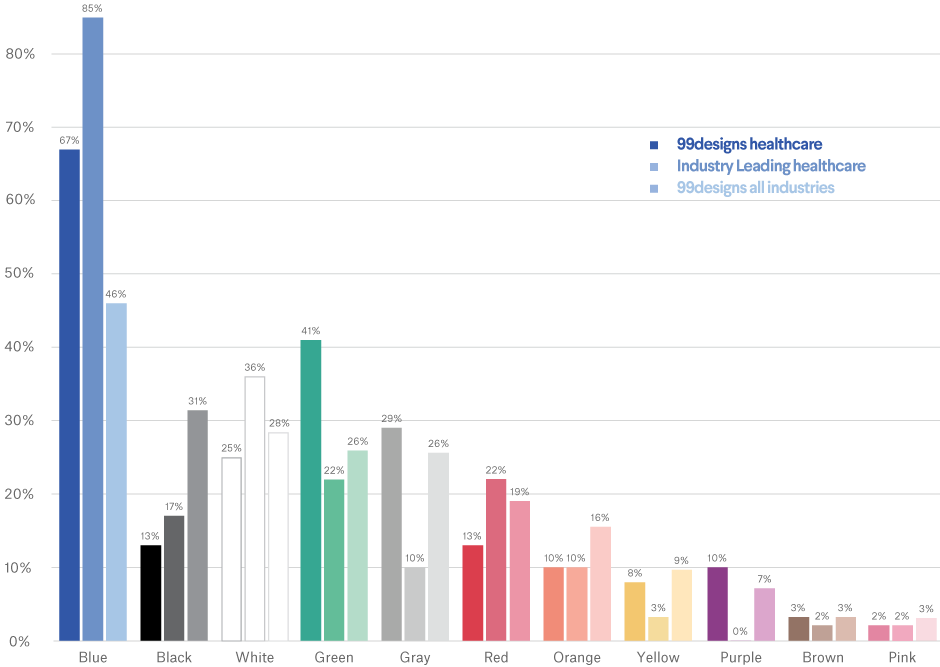
The healthcare industry relies on blue as a primary provider more than any other industry. When we look at industry leading providers, blue appears in nearly 85% of all logos. It’s also requested in over two out of every three healthcare logos sourced on 99designs. This choice makes perfect sense when we consider what customers associate with the color blue: knowledge, tranquility, security and trust. In the stress-filled environment of healthcare, where both well being and finances are vulnerable, blue is tried-and-true way to show your competence.
When we check up on the second most commonly used color, results vary based on the population. Industry leaders page white into action 36% of the time, but here at 99designs, green comes in second—requested by over 40% of healthcare businesses.
So what colors don’t measure high on the popularity scale? Brown, pink, purple and yellow. Because of its associations with dirt, brown’s unpopularity makes sense—we want our healthcare facilities to be clean and sterile. Yellow and pink, however, are both friendly, welcoming colors, which seem like they would have a place in an industry of care.
Logos from the top four healthcare brands by revenue generally follow these trends, though the specific role a company fills certainly has side effects on logo color choice:
While three feature a serious, deep blue, the red CVS logo is a clear outlier. Red, which can signify danger, blood and excitement, seems to be a strange choice at first, but not so when we look at other popular retail drugstores: Walgreens, Rite Aid and Target also rely on red. We see in the retail industry that red lures shoppers inside, so the bold logo works to draw attention to their stores. These companies aren’t directly dealing with life-or-death situations, so they’re comfortable seeking a dose of bravado.
Diagnosing how your company interacts with patients will help you determine the level of seriousness your brand needs to portray. This is just one aspect of your brand personality. Once you figure out what attributes describe your brand, it's easy to translate those traits into colors.
Taking your vitals: colors of brand personality in healthcare
Start determining your brand personality by asking yourself these six questions:
- Gender: Is my brand traditionally masculine or feminine?
- Tone: Is my brand playful or serious?
- Value: Is my brand luxurious or affordable?
- Time: Is my brand modern or classic?
- Age: Is my brand youthful or mature?
- Energy: Is my brand loud or subdued?
We'll use your answers to see what logo color works best for you.
Here's how healthcare businesses on 99designs define their brand personalities:
-
We analyzed the preferences of all industries and assumed normal distribution. Preference strength was figured on number of standard deviations from the mean.

From this we infer that people in healthcare want a logo that is subdued, serious and mature. These traits align with the following colors:
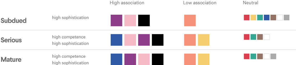
Based on this, we would expect to see a lot of blue, purple, pink and black healthcare logos, and very few that are orange, yellow and red.
In reality, we see a whole lot of blue, with small doses of white, green, gray and black. Blue has high associations with being perceived as both serious and mature, so it seems fitting that it enjoys high levels of popularity with healthcare firms. Companies lean on white for its reassuring associations with purity and hygiene. And green represents growth, refreshment, balance and nature: characteristics that add up to a clean bill of health for many healthcare companies, especially those with a focus on natural, organic living. But pink and purple healthcare logos are few and far between.
-
Logo Dish uses a blue and green palette to represent the serious and mature nature of Synova, a medical and biological research company.
-
The two-tone blues in this logo by oculus for parsec.io helps them stand out in a sea of blue medical logos.
-
Gaga vastard uses red in their logo design for Capstone, a medical marketing firm. The choice of red speaks to the retail aspect of Capstone’s business model.
While we didn’t expect to see red in many logos (it is the color of blood, after all), we do see it often prescribed to healthcare companies in the retail space. Additionally, the association with danger can be used as an advantage: the American Red Cross, for example, employs red to symbolize an urgent call to action in disaster situations.
What we prescribe: the colors healthcare professionals should explore
If your company directly treats life-threatening issues (a surgery center, for example), blue might very well make your patients comfortable. But if you’re willing to stray from blue’s safety net, there are several color options that can help you visually stand out and represent the role you fill.
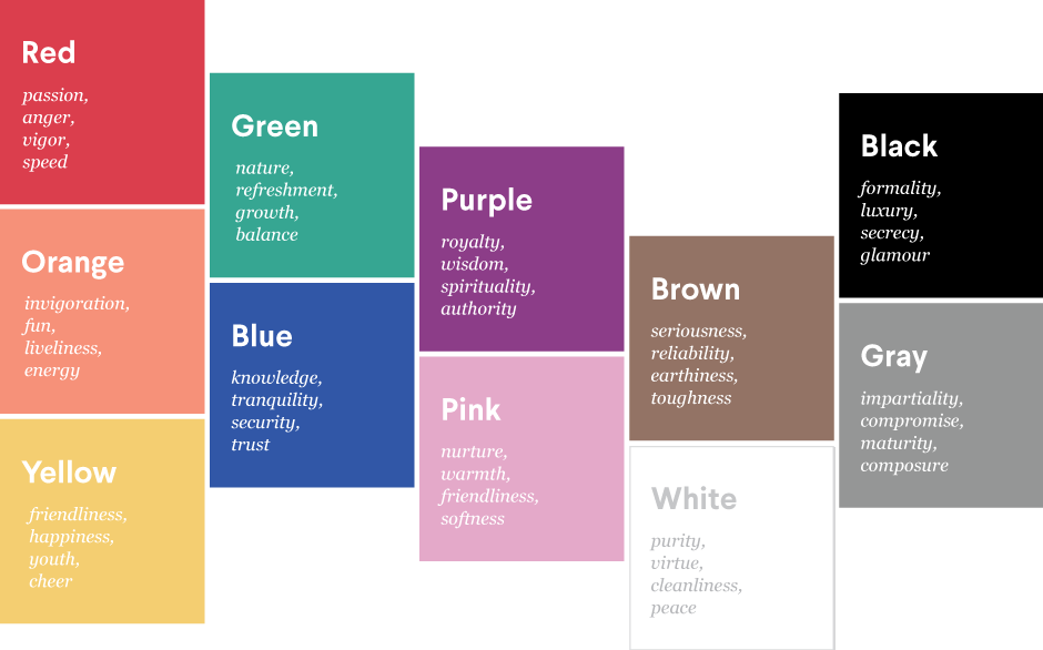
If you’re also a retailer, you might open your doors to an exciting red. Those pushing an all-natural approach may go green. Specialize in women’s healthcare? A soft pink may be appropriate. Purple’s spiritual qualities could work wonders for alternative treatments. And for children’s healthcare, bold, crayon-inspired colors would be appealing.
The demographics of your target population can also help you choose the right hue. While a hospital may choose cool and calming colors to portray a tranquil environment, an assisted living center might opt for warmer colors to convey a welcoming atmosphere. Logos from the following healthcare brands illustrate this:
-
Designer chilibrand got creative with bold shapes and colors in this logo design for an urban medical clinic in Australia.
-
Designer ataslayar dsgn used a bright yellow for this pediatric dentistry logo to speak to both the age range of its clientele and the brand’s name.
-
The use of gold in this logo design for Deschutes Dental Center by FriendlyLabel establishes the dental practice as state-of-the-art.
As you set out to design your healthcare logo, you’ll want to take your brand personality into account, and think about the traits you most want to convey. Color is a personal choice, but but understanding color psychology in marketing can help you make an informed decision for your small business.
Have we confirmed your choice for blue? Or made you gaga for green? Use our Designer Search tool to find a designer well-equipped to give your business a healthy dose of personality.
Blue collar, white collar, purple collar: what are the logo colors of other industries?
Get a healthcare logo design now!
Want to know more about how design impacts business?
Subscribe and be inspired by our best tips, trends and resources. We'll also send you the occasional marketing email and promotion (which you can opt-out of anytime).