logo with negative space letter

0
Created on 99designs by Vista
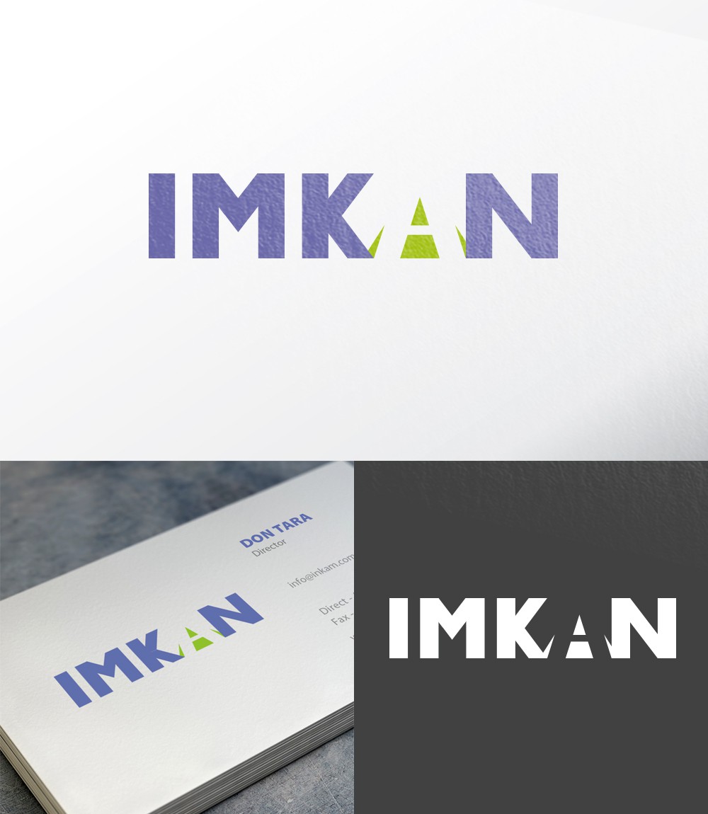
We use the inverted letter A in the logo. The symbol, that we got, is an open space, and perspective. It reflects new opportunities, a direction up and forward.
All other letters of the name are stable, reliable, strong.