Some of the biggest brands are based on outrageously simple design — infuriatingly so, at times. “I pour hours and hours into a logo,” you think, “someone else merely tweaks a font and winds up producing one of the most iconic designs in history.” Facebook, for example.
Simplicity can be deceptive, though. Sometimes the right modifications to a typeface, however small, are monumentally important and require a truly special eye for design. Let’s take a look at that ubiquitous Facebook logo and see how simple it really is.

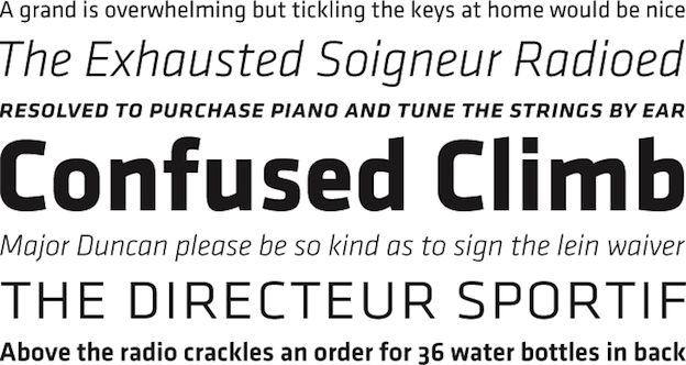
Recognize this? It’s a sampling of Klavika, the typeface used in Facebook’s logo

The Facebook logo is based on Klavika, with some modifications. Can you spot them?
There are three main characters in this story: Process Type Foundry, which created the typeface “Klavika” in 2004, Mark Zuckerberg, who needed a logo for his growing website in 2005, and design firm Cuban Council, which tweaked Klavika for Mark, thereby determining the identity of what would be one of the world’s highest-valued companies.
Eric Olson, a Minnesota-based graphic designer with a love for typography, started Process Type Foundry in 2002 with no business plan and no customers. His talent was clear though and the business grew. Klavika came into being in 2004.
“Frustrated with a lack of fonts both versatile and modern, we set out to design Klavika as a full-featured, do-it-all sans serif for the needs of the 21st century,” says Process Type Foundry. “Our result is a design that’s unadorned, modern and infinitely flexible.” “And since part of the goal was flexibility,” they add, “we’re happy to report that since its introduction in 2004, Klavika has found its way into a wide variety of media from print to pixels.” They don’t name names.
Cuban Council does. On their website, they recall “back when nobody gave a toss about thefacebook.com, we were visited by one Mr. Zuckerberg at our SF offices. Quizzically, he asked us “Tell me… guys, what is ‘design’?” In response, we pulled out this awesome kick-ass logo from our backpacks, flicked it casually across the table and said … “Mark. Dude. Does this answer your question?”
An epic retelling but what did Cuban Council really do to make the logo so “awesome kick-ass”? It is, after all, over 90% Klavika. Shouldn’t Olson receive most of the credit?
That remains up for debate, but Cuban Council’s contributions were important. Klavika has a jagged look to it which makes it distinctive, but also produces an awkward meeting of the “f” and “a” in “Facebook.” So they straightened that out, widened the “c” to make it commensurate with the “e”, and pushed the “k”s disconnected pieces together.

Fonts in Use highlights the modifications that Cuban Council made to Klavika for the Facebook logo
Seemingly small potatoes, but a look at the unmodified and modified versions next to one another shows a world of difference. Klavika is versatile, memorable and distinctive. Cuban Council’s modifications lend it a smoothness and solidity befitting the brand.


